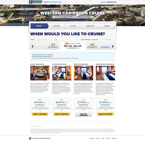
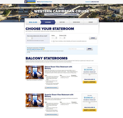
Royal Caribbean gave a face lift to part of its web site last night, which updated the look of the site that guests use to book their cruises.
Back in March 2015, Royal Caribbean updated the look of its web site but the update was largely only for the home page and a few pages outside of it. Much of the rest of the site retained the old design look.
With the latest update, the part of the site that allows guests to price cruises and book a sailing online now matches the homepage in terms of look and feel.
With the new design, guests can more easily flow between the steps of choosing the right sailing and stateroom for them. The updated look provides a more "at a glance" look at everything occurring in the reservation process.
This latest update to the site's design does not include all parts of the site. Other areas of the site still retain the old look, including My Cruises and the FAQ sections.
Do you like the new design for the cruise booking engine? Share your thoughts in the comments!


