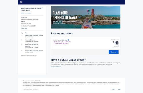
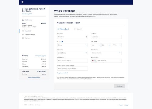
If you are booking a Royal Caribbean cruise from the cruise line website, expect a new look to the process.
Royal Caribbean rolled out an update to its website on Thursday, which has a cleaner look to the booking process.
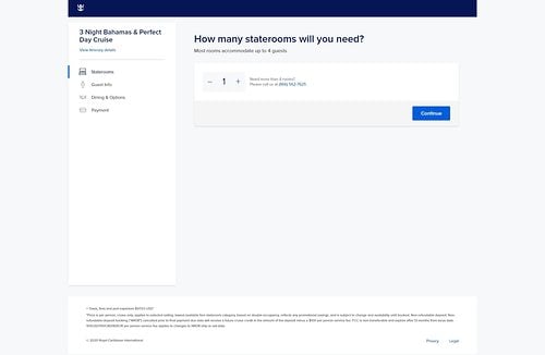
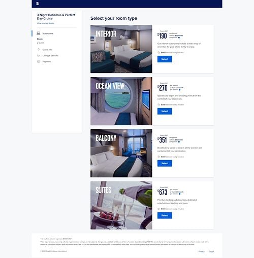
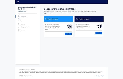
Once you select a particular sailing, the steps involved in booking the cruise have a new design to them.
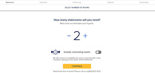
Old look to booking site
New look to booking site
Select a stateroom
Choose stateroom assignement
Guests information
Payment information
So far, the new look begins to appear once you select a sail date. In addition there are certain updated room descriptions as well more virtual tours.
The new look to the booking engine follows Royal Caribbean's last booking site design update in August 2017.
RoyalCaribbeanBlog readers shared their opinions of the new site design on our message boards, and generally were happy with the new look.
Razorrayy commented, "I absolutely love the new booking tool on Royal Caribbean website, just being able to get more details on your itinerary is awesome!"
WAAAYTOOO found a small functionality lift, in addition to the new look, "The only improvement that I can see so far is that you can now review the itinerary once you are in the mock booking. Before you could never see the itinerary once you started looking at cabins."
With new change, comes also critique for how to make the site even better. SpeedNoodles wished for a change in booking terms up front, "When will they change it to show us the refundable price before we have to enter name/address/signooverfirstbornchild?"


